A short, working guide to keep Brainzie looking like Brainzie everywhere it appears. Magenta-led, clean, energetic and confident.
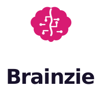
The Brainzie mark is a brain rendered with circuit traces and nodes — biology and computing in one symbol, in the signature magenta. Use the supplied vector files; never redraw it.




On magenta or any saturated background the colour mark loses its silhouette — only the white circuitry shows. Always switch to the reversed (white) logo.
Magenta is the signature — it should do most of the brand’s work. Violet supports; orange and coral are sparks used sparingly. The warm gradient is an occasional flourish, never the whole identity.
Flourish gradient — a rare accent only.
Space Grotesk
Display & headings. Geometric, distinctive, friendly. Weights 500–700.
Inter
Body & UI. A clean, highly readable workhorse. Weights 400–700.
Both are free, open-source and load from Google Fonts. Headings use tight letter-spacing (≈ −0.02em); body stays at default spacing for readability.
Brainzie is a branded house: one master brand, products named by plain descriptors — Brainzie Academy (courses), Brainzie Swim, Brainzie Money. Every product borrows, and builds, the Brainzie name.